Did you know I was originally brought on to Pixel Scrapper to be the pocket scrapping designer? True story. It was pretty much the only type of scrapping I did, and my first-ever design offering, for the Pixel Scrapper February 2013 “Retro Kitchen” blog train, was a huge batch of journal cards and papers. Marisa, the site owner and main designer at Pixel Scrapper, wanted to expand into offering pocket scrapping/project life designs and after we’d known each other a while from my participation in a bunch of blog trains and as a student in her Designer Basics course, she asked me to come on board.
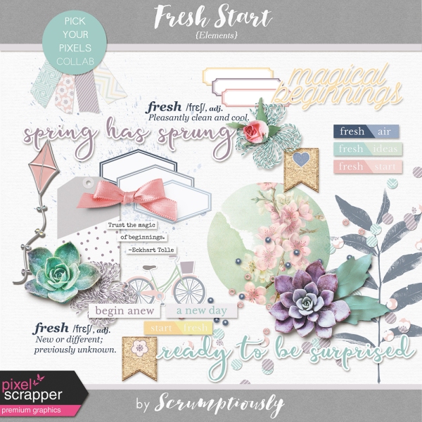
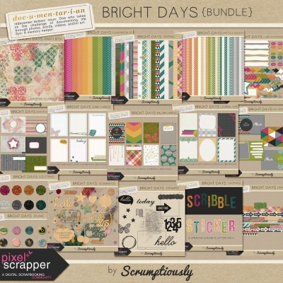
My first kit for Pixel Scrapper, Bright Days, was completely designed for people doing pocket scrapping. It was the pocket scrapping kit I would have wanted to scrap with. Bright Days had title cards, journal cards, and filler cards. It had papers (for pocket page backgrounds and coordinated DIY pocket cards), alphas, flair, stamps, washi tape, and a ton of labels. When I sent it to my creative team to work with, I asked them if there was anything else they’d like to see in the kit. They said it would be helpful to have a little more dimension added to the kit, stuff like wood veneer items (stars, hearts, arrows, numbers), sequins, glitter spills, buttons, staples, etc. So I added a small element pack to the kit (and went right up to the limits of my ability, at the time, to design dimensional items).
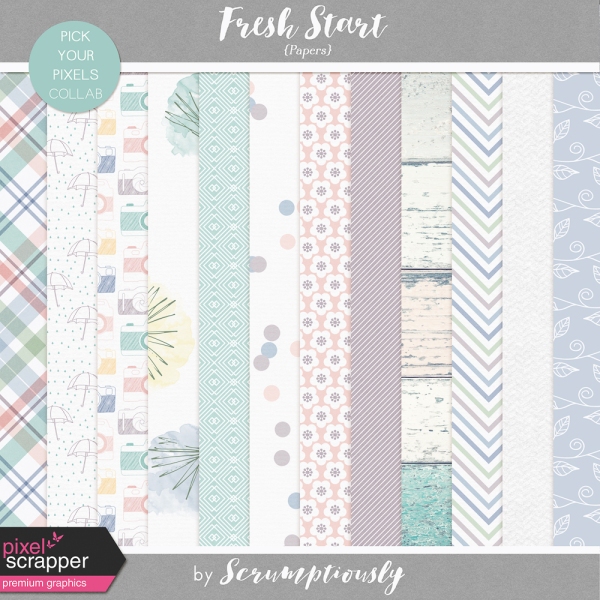
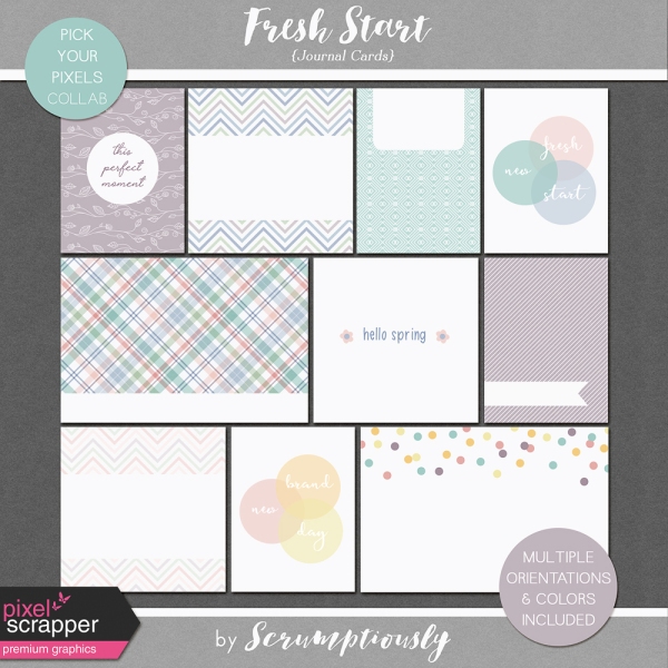
My next kit was Pocket Basics, Vol. 1. This was a big bundle of stuff for pocket scrappers; again, it was the sort of stuff I myself wanted to have on hand for my pocket pages. Tons of templates (with the then-in-vogue rounded corners on the pocket spots), photo overlays with days of the week and frames for captioning, date stamps, and a set of alphas, papers, and journal cards in neutral colors to coordinate with any page.

Around this time, I started to notice there were very few people doing pocket scrapping in the Pixel Scrapper gallery. My original creative team even stopped pocket scrapping! So then things got a little weird in my brain. Part of me was still designing for myself, the pocket scrapper. And part of me wanted to design for the Pixel Scrapper community, to make designs people would want to scrap with. Even though I knew that one of the points of bringing in a pocket scrapping designer was to attract new pocket scrappers to the site with more offerings to interest them, I couldn’t seem to keep myself from visualizing my audience as the current PS members. (Interestingly, around this time Marisa actually started her pocket scrapping project that she has now done successfully for the past several years, and created many wonderful pocket scrapping resources along the way.)
Trends were also changing in the pocket scrapping world. Back in the early days of Project Life, most pocket scrappers would get one kit and scrap their whole year with it. Back when I started there only was one Project Life kit to choose from! Then PL started publishing more and more kits, and people started to mix it up more, maybe using one kit for a few months, then switching to another. Now there are more Project Life and pocket scrapping kits than I can count. Rather than a single kit with enough cards in that palette and theme to scrap a whole year, most people mix and match from a variety of kits, or use a kit to do just one pocket-page spread. Pocket layouts have gotten more elaborate and layered over time as well.
My next kit, Already There, reflected my having a foot in both worlds. While making the kit, I taught myself tons of new techniques and grew my skill in the dimensional-elements department. Already There has four packs of journal/filler/title cards, but I think it’s also much more flexible in terms of being suitable for both pocket pages and traditional layouts. It even has stuff like word art that, given its size and proportions, is clearly intended to go on a 12×12 page rather than in a pocket.

Hmm… you know, I started this post feeling like I’ve drifted away from designing for pocket scrappers, but as I review my contributions to Pixel Scrapper perhaps that is not as true as I think. My favorite Project Life-brand kit of all time is Rain by Nisa Fiin, and when I hold my work against this example I am clearly spending a lot of time designing non-pocket-specific items. Rain consists of papers and title cards, filler cards, and journal cards with lots of room for actual journaling, in 3×4 and 4×6 sizes. That’s it, nothing else. It was created back when PL kits contained enough variety to use throughout the whole year.
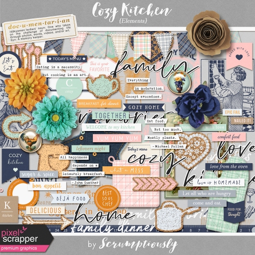
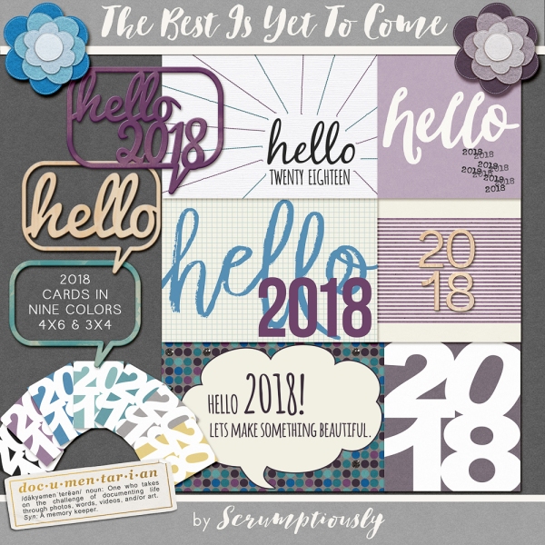
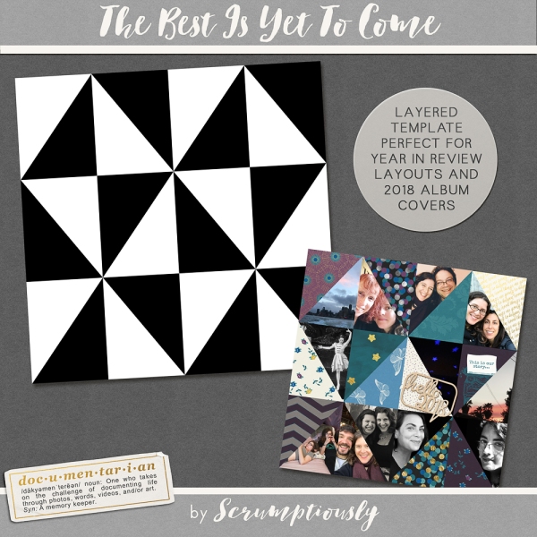
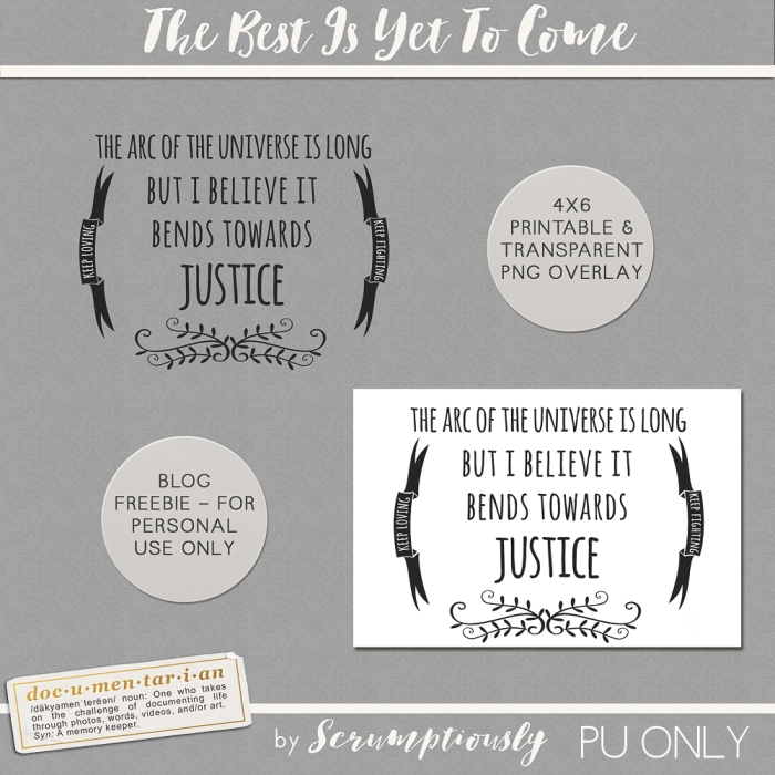
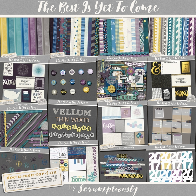
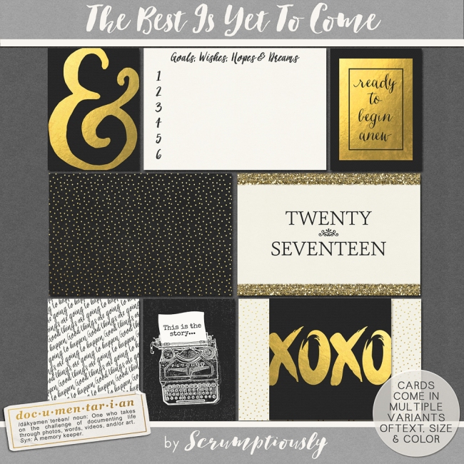
However, when I look at what I’ve created since I started designing for Pixel Scrapper, I see I haven’t actually strayed that far from my roots. My most recent kit, The Best Is Yet to Come, contains loads of papers and elements for traditional scrapping, but it also has 80 pocket cards. My contribution to the recent Cozy Day designer collaboration was three sets of pocket cards, with every card design offered in three sizes. In fact, all my collaboration contributions have included pocket cards and other items intended for pocket scrapping, like these date tags from the Good Day collaboration.

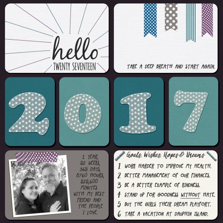
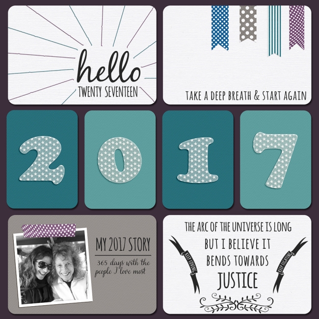
So here we are now at In the Pocket, our first pocket scrapping-specific blog train! One of my New Years resolutions this year was “no more design projects with deadlines.” Every time I have a design project with a deadline, I run myself ragged right at the end doing all the preview-making, uploading, etc. I don’t know how other designers aren’t burdened by this, I know it means I must be doing something the hard way, but it takes me HOURS and I usually end up staying up very very late. So for 2017 I decided to take a break from blog trains, not require myself to contribute to each designer collaboration, and not create any other themed works like The Best Is Yet to Come that really did need to be released on time at New Years. A bunch of 2017 title page cards would not make sense in April, you know?
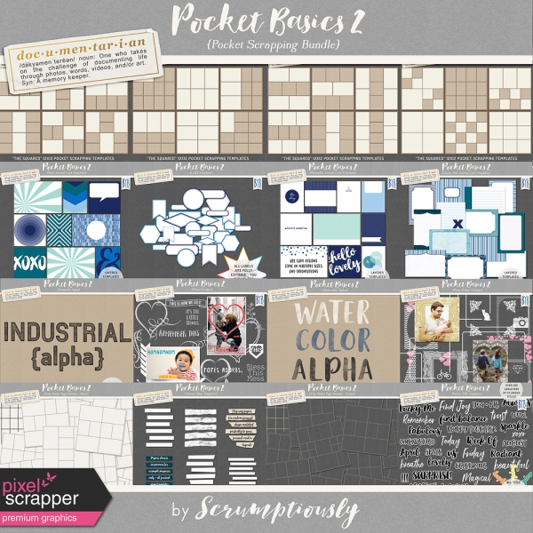
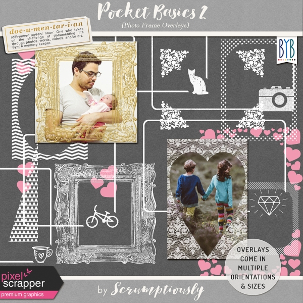
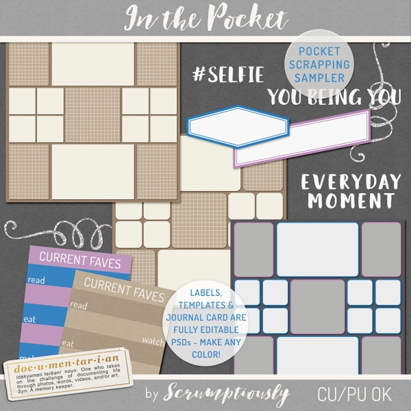
So I didn’t even know until last night that we were doing a pocket scrapping neutrals-focused blog train this month! When I realized it I was super excited and knew I had to participate. What would have been AWESOME was if my next bundle, Pocket Basics 2, which is sooooo close to being finished [UPDATE: It’s finished!], had been ready to release in time for the blog train. I could have showered you guys with pocket scrapping supplies! But as I mentioned before it takes me ten million hours to actually get my designs from the “finished being designed” stage to the “ready to release on the site stage.” Plus, nothing has been QC’d yet, and that would have been a little sketchy. 😉 So…. instead I stayed up until 3 AM making you something new! I decided that since the whole Pocket Basics 2 bundle isn’t ready to release, I’d make you a sampler of the kinds of things that will be in it. Download is linked below preview (you only need to choose one) and you can read on for more detailed information about what’s inside.
Direct download link (may not be available due to bandwidth overage):
DOWNLOAD IN THE POCKET SAMPLER
Mediafire link:
DOWNLOAD IN THE POCKET SAMPLER
Like Volume 1, Pocket Basics 2 is a big bundle of supplies created to support pocket scrappers. The trends have changed in pocket scrapping, and rounded corners have given way to square corners, so PB2 contains a ton of crisp square-corner pocket page templates like the one in the top left of the sampler preview. There are lots more photo overlays, some like the phrases and glitter swirls shown in the sampler which make cute stamps when put over a photo, and some the type you can use to put a frame or caption over your photo.

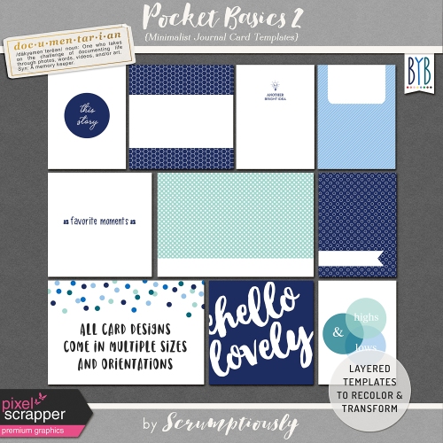
One of the most often-requested items on the site is more card templates (I guess people are pocket scrapping after all? Or they use them for traditional or hybrid scrapping?). The journal card templates in Pocket Basics 2 allow you to take any kit and make coordinating journal cards to match the kit colors, which will means you can adapt traditional scrapbooking kits for pocket layouts. I’ve included a card template in this sampler, a fun “Current Faves” card. The card template is a fully editable layered file, which means you can change the colors, clip different papers to it, even download the free font I used (link included) and edit the text, if you have different favorites you want to document. (The text is also included as image layers, so there’s no need to download the font if you just want to use the wording as-is.)

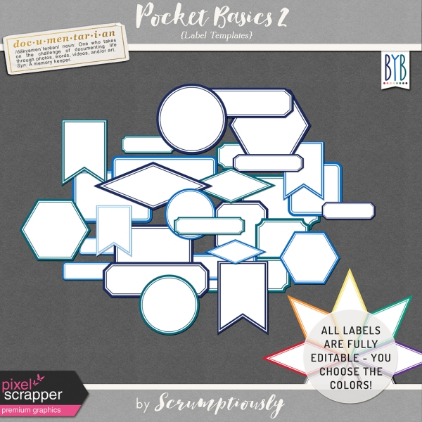
Remember earlier I was mentioning the Project Life Rain kit, and how it has everything I would want in a pocket scrapping kit? Well, that’s not quite true… the main thing I always want, with any pocket scrapping kit, are color-coordinated labels. I just can’t get enough of them! Labels are my favorite way to add captions and dates to photos, and to make a bit of journaling stand out on a card. Pocket Basics 2 has all kinds of labels, in all different shapes and sizes, and they’re in easy to use layered template form, so you can customize the color of the label border and even the label itself. I’ve given you two here in this sampler to play with. Try them out and perhaps you’ll agree with me about how satisfying it is to have labels perfectly matched to every kit. (By the way, just FYI, these labels and all the sampler designs are newly created for this blog train, there are no repeats in Pocket Basics 2.)
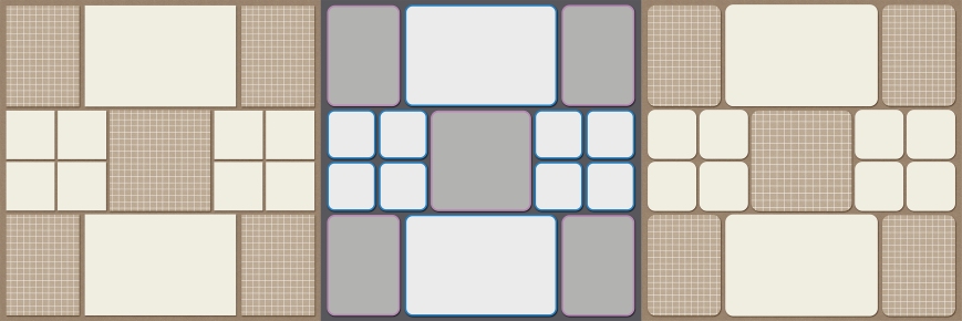
I get the impression from reading the in-progress thread for this blog train that many people participating have not yet tried pocket scrapping. I hope this blog train will inspire you to give it a try and see how it feels! I decided for this sampler to provide the same layout template in three different pocket scrapping styles. Like all Documentarian templates, these three layout templates are deliberately arranged with more intuitive layer ordering than most similar templates – I find them much more usable than typical pocket scrapping templates which often have the pockets in no particular order in the layers palette. This template pack includes each pocket scrapping template in both layered TIF and PSD formats. I suggest using the layered TIFs if your program supports them because the file size is smaller; either way you can delete whichever version you won’t be using. Save that hard drive space!
The round-cornered one in tans and browns is in the style of the templates in Pocket Basics Vol. 1. The square-cornered one is an example of the style used in the layout templates Pocket Basics 2. (In other fun template news for Pocket Basics 2, it is my first template kit with the option of .PAGE format! If you’d like any of the sampler templates in .PAGE format, please let me know in the comments below.)
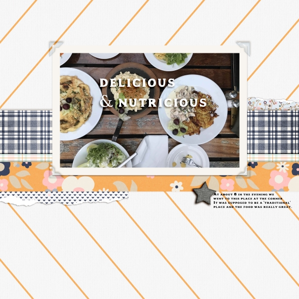
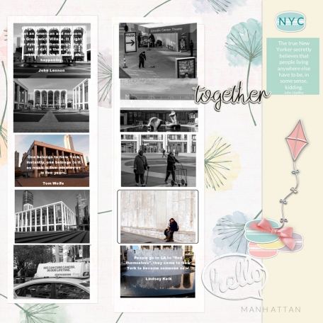
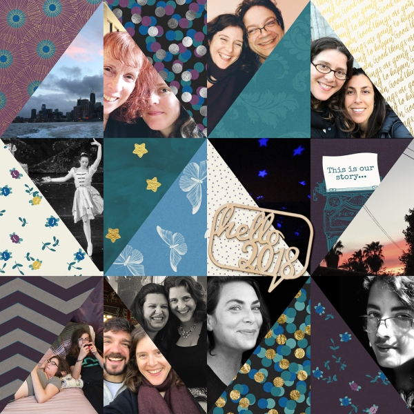
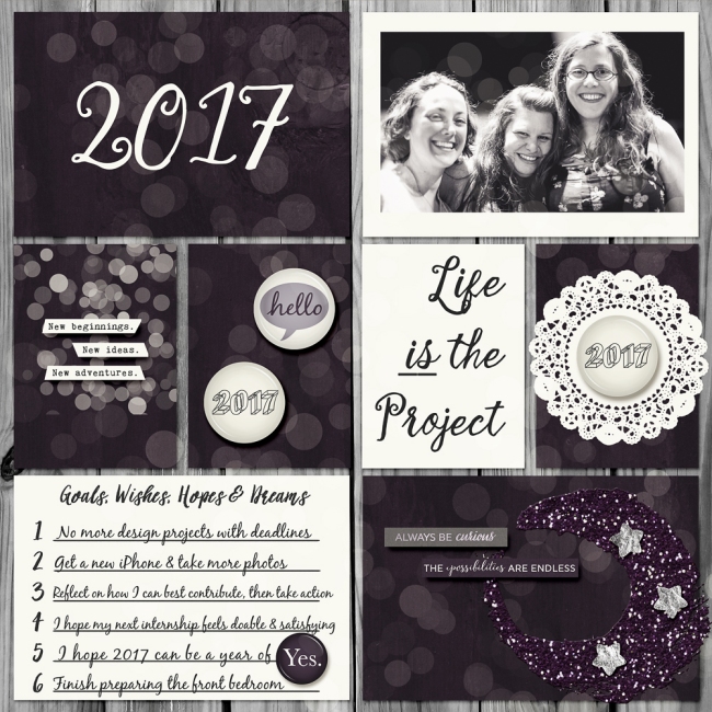
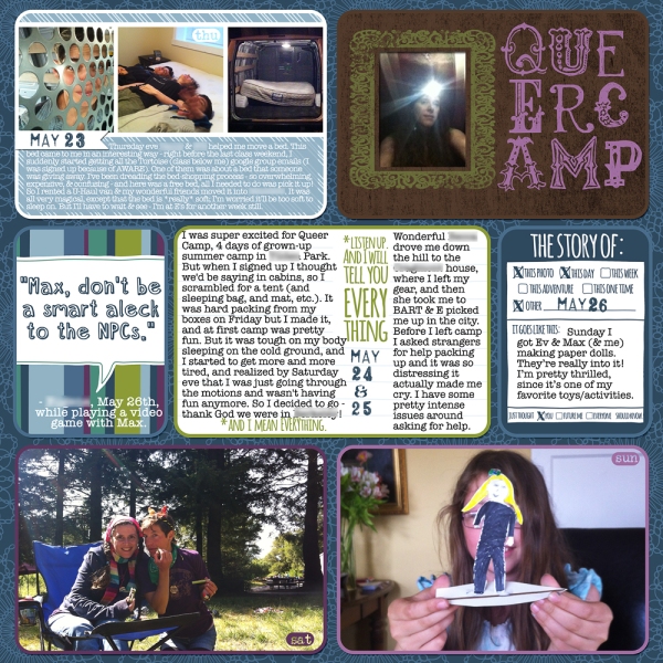
The grey and white one with the colored borders is in the style of one of my favorite project life scrappers, Kimberly Kalil. I love how colorful and fun her pages are, and for me they strike the perfect balance of layering, ornamentation, and font variety, which makes her pages look “interestingly busy” rather than “overwhelmingly chaotic.” I think the colored borders add great definition and interest to the the page. I have a couple of Kimberly-style templates already on Pixel Scrapper as well. Here’s a Kimberly-style layout of mine using my beloved Rain kit.
Well fifty trillion words later, that’s it from me. Maybe I could get my kits done faster if I spent less time writing blog posts! But you know I love it 🙂 I hope you enjoy this sampler and please let me know what you think!
Question for you: Given that my task is to focus towards making pocket scrapping kits, what would you like to see from me? Are you a traditional or hybrid scrapper who might find some particular types of pocket scrapping designs useful? If you’re a pocket scrapper, what are you looking for? Anything you want to share with me (in the comments here or you can email me directly) would be super appreciated. I really would like my designs to be useful for you. Otherwise I suppose I’ll just keep on making stuff I like and hope you like it, too!